SPACE TOURISM
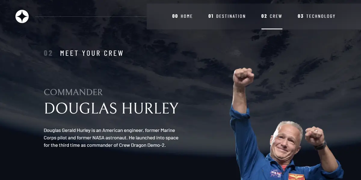
View Live Site ↗A multi-page Space Tourism site from a Frontend Mentor Figma — HTML, CSS, and a small amount of JS for tabs and navigation. Home, destination, crew, and technology, laid out for mobile through desktop.
The brief was fidelity. Match the design system, keep type and spacing honest, and make the tabbed destination/crew/technology views feel like one product instead of four separate pages. Backgrounds, photography, and the numbered pagination on Technology are all in CSS and a bit of vanilla JS — no framework.
Responsive work was the real test. Desktop is a cinematic full-bleed; tablet and mobile collapse the nav, stack the copy, and keep the tabs usable with a thumb. Live at spacex-tourism-main.vercel.app.
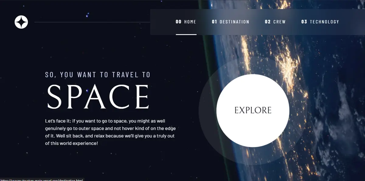
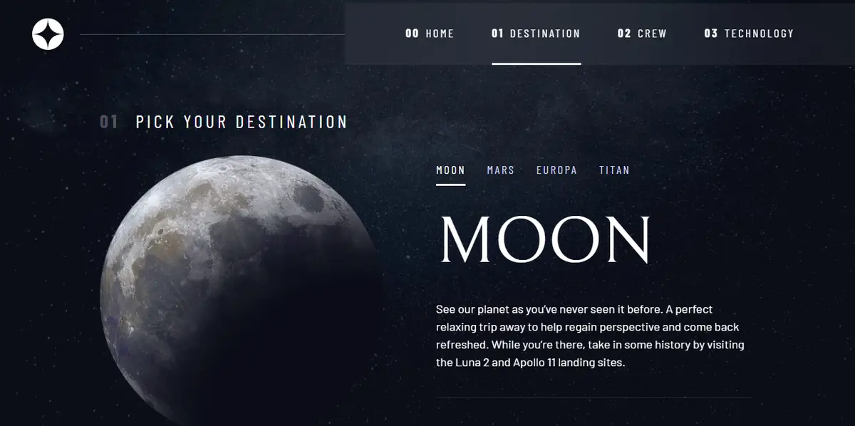
Each page has one job. Home sells the trip — a single headline, a short pitch, and a large explore control. Destination is a tab interface over Moon, Mars, Europa, and Titan: swap the planet, stats, and copy without leaving the layout. Crew uses the same pattern for the team. Technology uses numbered controls and a landscape/portrait image swap by breakpoint.
No React. HTML pages, one stylesheet, navigation.js and tabs.js. That was the point — prove the layout and the interaction without a component library carrying it.
The design system page was used as the source of truth for type, colors, and spacing before any screen was built. If the Figma said 32px tracking on a heading, the CSS says 32px tracking.
Assets live in `/assets`. Data for destinations, crew, and technology is a JSON file the tabs read from, so copy and stats stay in one place. Code: github.com/notramm/Space-Tourism.