VELORA
View Live Site ↗A personal finance dashboard built in React to make money feel readable — balance, income, expenses, and savings in one view, with charts that actually explain the last six months.
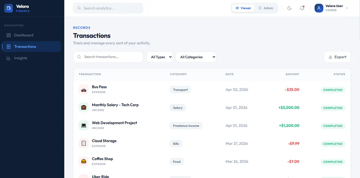
Velora is a role-based finance UI, not a spreadsheet with a dark theme. Summary cards, a 6-month trend, and a category breakdown sit on the home view. Transactions get search, type/category filters, sorting, and CSV export. Admin can add, edit, and delete; Viewer stays read-only. Switching roles updates the UI immediately.
The design problem was density. Finance UIs either hide the numbers or dump every row on screen. Glassmorphism, a dark/light theme, and Framer Motion keep the dashboard calm while Recharts handles the trend and donut views. Built with React, Tailwind, Context API, and Lucide. Live at velora-finance-dashboard-pi.vercel.app.
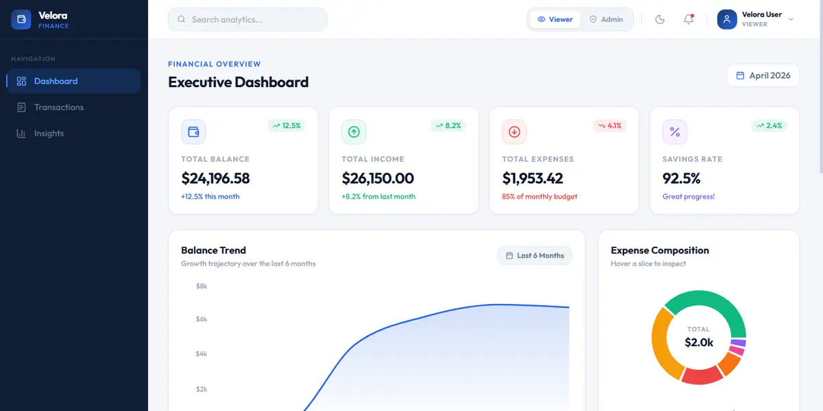
Three things had to hold. One: the dashboard has to answer “how am I doing?” in one glance. Balance, income, expenses, and savings are the first row. The 6-month chart and category donut sit underneath so the story is visual before it is tabular.
Two: transactions are a working table, not a mock. Search, filter by type and category, sort, and export to CSV. Three: permissions are visible. Viewer cannot mutate. Admin can. The navbar toggle is not a costume change — controls appear and disappear with the role.
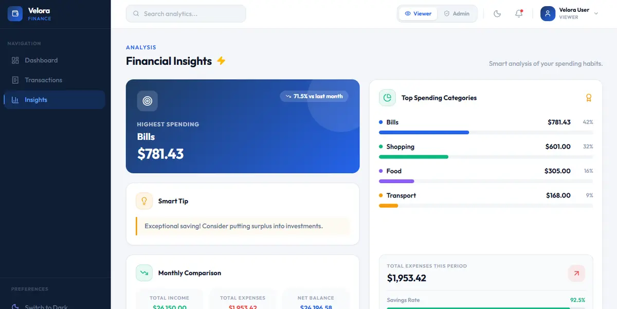
The insights layer is where the UI earns its keep. Top spending categories, month-over-month comparison, and adaptive copy sit on top of the same dataset as the table, so the dashboard and the ledger never disagree.
Stack is React with Context for role and theme, Tailwind for layout, Recharts for the charts, Framer Motion for motion, date-fns for ranges. No backend — this is a frontend product, designed to look and behave like a production app. Code: github.com/notramm/Finance-Dashboard-UI.